By The Bay
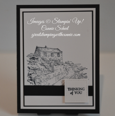
I love stamps that have detailed line art, they are so flexible. Normally I would look at this and think I should add colour to the image, but sometimes the simple beauty of line art can help you easily create a stunning card.
My card was inspired by the Global Design Project Challenge - Case the Designer.
The focal point for the card is clearly the bottom section, and I really liked the square Shawn used for his sentiment, I was definitely using a square for my card!
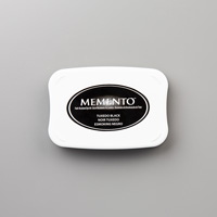
I don’t often make cards in just black and white, Stampin’ Up! has so many gorgeous colours of card stock and coordinating designer series papers, but I love the look it creates, so I’m happy with how this card turned out.
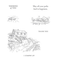
I used one of the images from the By The Bay stamp set, a set you can get for free with any $60 order. The sentiment is from the same set. I love stamp sets that include both images and sentiments, and this set has some great ones. You can see one of the other sentiments on this card.
Leave a comment and let me know what you think!

